top of page
Type & Design
I really enjoyed this type class with professor Kim. The final project was a coster set in which we created 4x4 coasters featuring typography and then physically created the coasters. From start to finish I learned to use my resources, find what I needed, and use new materials (and learn more about materials I've used before).
GRA 3202C @ UCF
Type & Design
Fall 2018
Professor: Joo Kim
Grade: A


1/8
 |  |  |
|---|---|---|
 |  |  |
 |  |  |
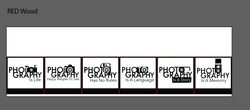
 |  {Title Type Book} |  {Title Type Book} |
 {Typography art} |  {Title Type Book} |  {References Type Book} |
 {Title Type Book} |  {Anatomy Of Typography} -Added terms |  {Classification Of Typography} |
 {Classification Of Typography} |  {Classification Of Typography} |  {Anatomy Of Typography} -Info Updated |
 {Classification Of Typography} |  {Classification Of Typography} |  {Anatomy Of Typography} -Reds made less harsh |
 {Anatomy Of Typography} -Dots removed in favor of outlines that better show which part of the letter is being pointed out. |  {Anatomy Of Typography} -Made based on first type anatomy page, no critique given |  {History Of Typography Timeline} -Colors changed to fit new pages |
 {History Of Typography Timeline} -Colors changed to fit new pages |  {{Anatomy Of Typography} -Detail added to chosen layout |  {Anatomy Of Typography} -Layout changed to add interest -Test Layout 3 |
 {Anatomy Of Typography} -Layout changed to add interest -Test Layout 2 |  {Anatomy Of Typography} -Layout changed to add interest -Test Layout 1 |  {Anatomy Of Typography} -Colors changed to add contrast -Original Layout |
 {History Of Typography Timeline} |  {History Of Typography Timeline} |  {History Of Typography Timeline} |
 {History Of Typography Timeline} |  {History Of Typography Timeline} |  {History Of Typography Timeline} |
 {History Of Typography Timeline} | 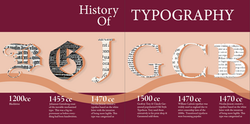 {History Of Typography Timeline} |  {History Of Typography Timeline} |
 {History Of Typography Timeline} |  {History Of Typography Timeline} |  {History Of Typography Timeline} |
 {Dance Of Typography} #2 |  {Dance Of Typography} #2 |  {Dance Of Typography} Progress 5 [-Text Darkened] [-Figure Darkened] [-Text Curved] [-Background Changed] |
 {Dance Of Typography} #2 |  {Dance Of Typography} #2 |  {Dance Of Typography} Progress 5 [-Text Darkened] [-Figure Darkened] [-Text Curved] [-Background Changed] |
 {Dance Of Typography} Progress 5 [-Text Darkened] [-Figure Darkened] [-Text Curved] [-Background Changed] |  {Dance Of Typography} Progress 5 [-Text Darkened] [-Figure Darkened] [-Text Curved] [-Background Changed] | 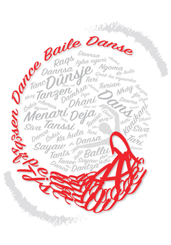 {Dance Of Typography} Progress 4 -Type Still Too Boring -More Curves In Type -Loose some Legibility -Remove Paint lines -Figure too Light -Text Too Light [-Text Darkened] |
 {Dance Of Typography} Progress 3 -Text too light [-Background text made more interesting] | 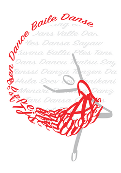 {Dance Of Typography} Progress 2 -Background Text is Boring [-Created a background within the dress which is now curved to draw the eye] |  {Dance Of Typography} Progress 1 -Background Boring |
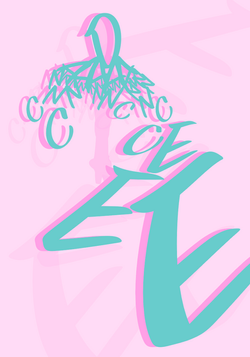
 {Create Your Own Typeface} Final |  {Create Your Own Typeface} First Draft |  {Create Your Own Typeface} Progress |
 {Create Your Own Typeface} Progress |  {Create Your Own Typeface} First Critique |  {Create Your Own Typeface} Sketches |
bottom of page